File Viewing
The primary component for viewing file data allows switching between two main modes: Tree View and Source View. These are accessible by clicking a file in the File Management section.
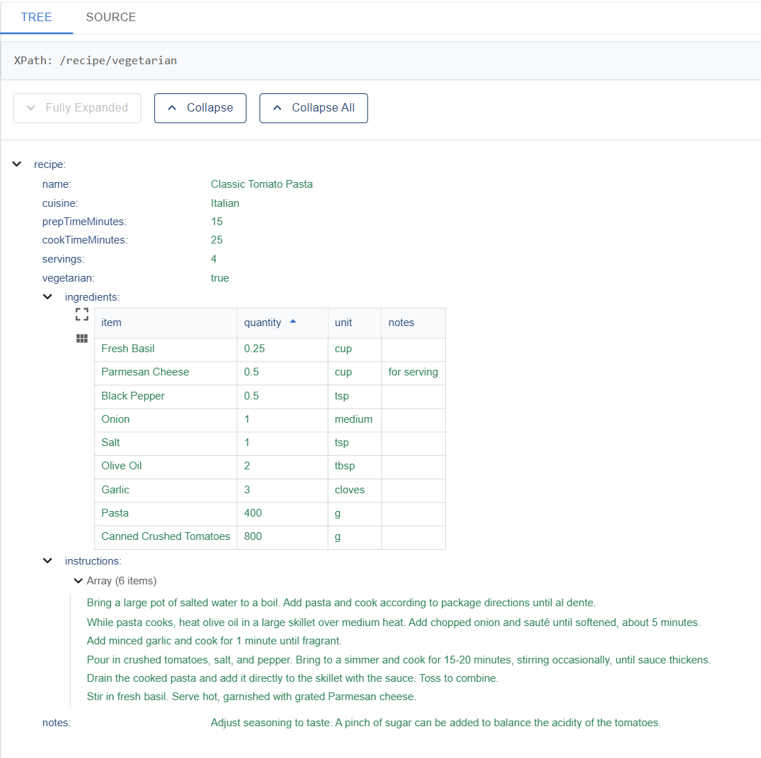
Tree View
This view renders hierarchical data in a nested, expandable tree format.
Core Features
- Hierarchical Display: Shows the nested structure of the data (e.g., XML elements, JSON objects/arrays).
- Expand/Collapse:
- Individual nodes can be expanded or collapsed using the arrow icons (▶ / ▼).
- Global controls are available:
Expand button to expand all nodes one step simultaneously. The keyboard shortcut shift+right-arrow can also be used.Collapse button to collapse all nodes one step simultaneously. The keyboard shortcut shift+left-arrow can also be used.Collapse All button to collapse all nodes back to the root.
- Key-Value Display: Shows object properties or XML element tags alongside their corresponding values.
- XPath Copy: When a node is clicked, the XPath of the node is displayed in a status bar at the top of the window. The XPath can be copied to the clipboard by clicking the copy icon, or directly on the status bar.
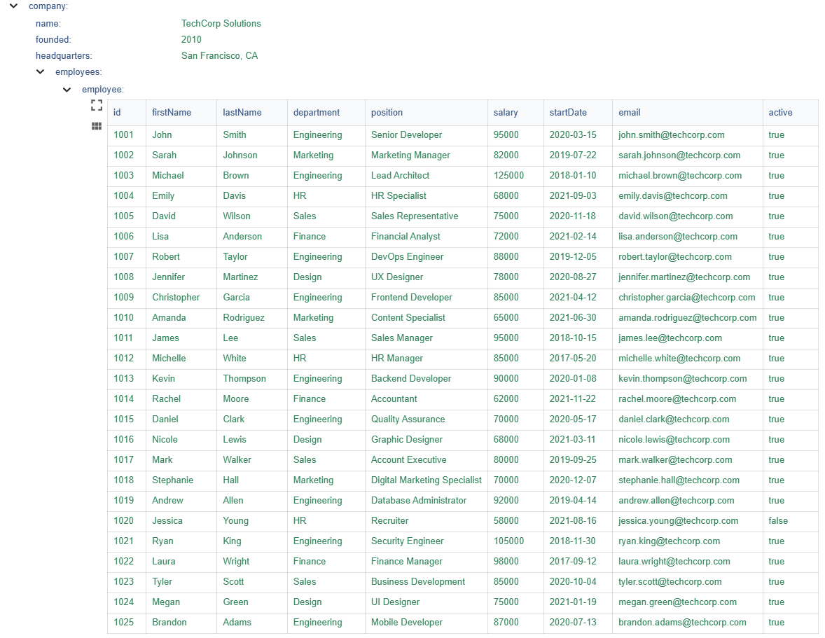
Nested Grid View
When the Tree View encounters an array of objects (where each object has the same keys, representing tabular data), it renders this array as an interactive grid instead of a standard list of tree nodes.
- Tabular Display: Presents array items as rows and object keys as columns.
- Sorting: Clicking a column header allows sorting the grid data by that column (ascending/descending). Icons (↑ / ↓) indicate the current sort status.
- Filtering:
- A filter icon on column headers (visible when hovering over the column header) opens a filter menu.
- Supports various filter operations (e.g.,
contains, equals, starts with, is empty, is not empty).
- Users can input a filter value.
- Applied filters narrow down the rows displayed in the grid.
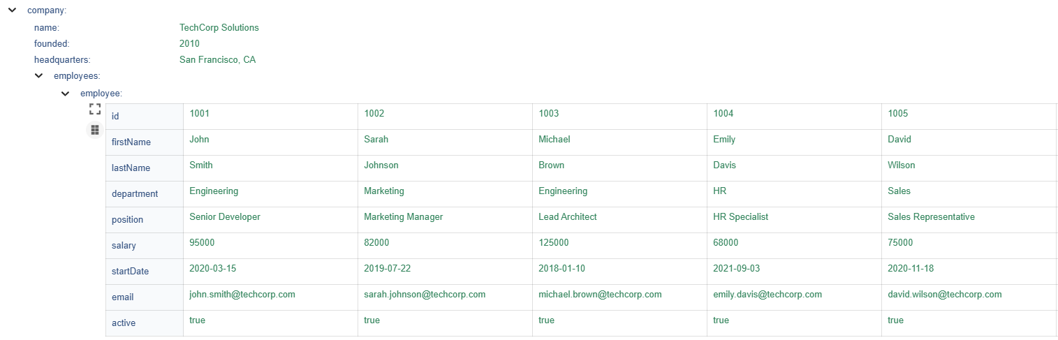
- Card View Toggle: Clicking the grid icon toggles between two layout modes:
- Tabular View: Displays data in a traditional table format where each attribute forms a column header and each data item is presented as a separate row.
- Attribute-oriented view: Transposes the layout so each attribute becomes a row header, with all corresponding values from the dataset displayed horizontally across that row.
This layout toggle allows users to choose the optimal perspective for their data analysis - the tabular view for comparing individual items side-by-side, or the attribute-oriented view for examining how values vary across a single attribute.
Tabular view: Each row shows one complete data item with all its attributes listed as columns
Attribute-oriented view: Each row shows all values for one attribute (e.g., all firstNames: John, Sarah, Michael, Emily, David)
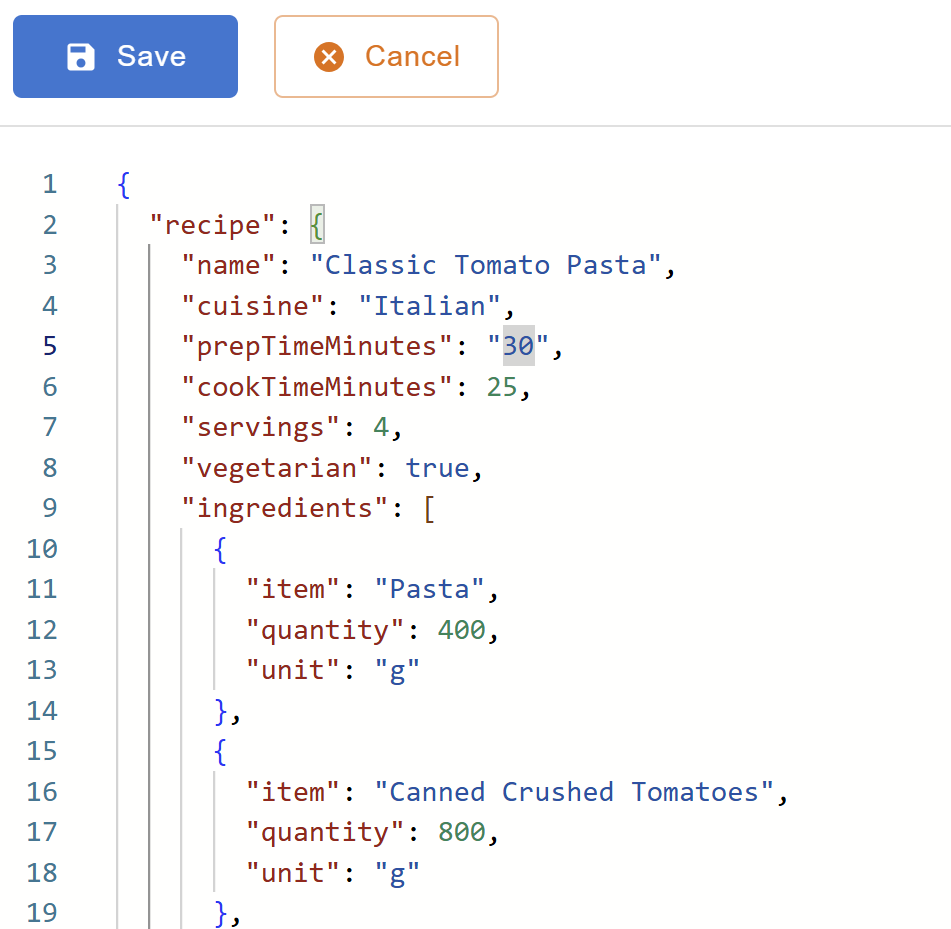
Source View
This view provides a raw, syntax highlighted text representation of the loaded file content, utilizing the Monaco Editor. It also includes tools for data manipulation and comparison.
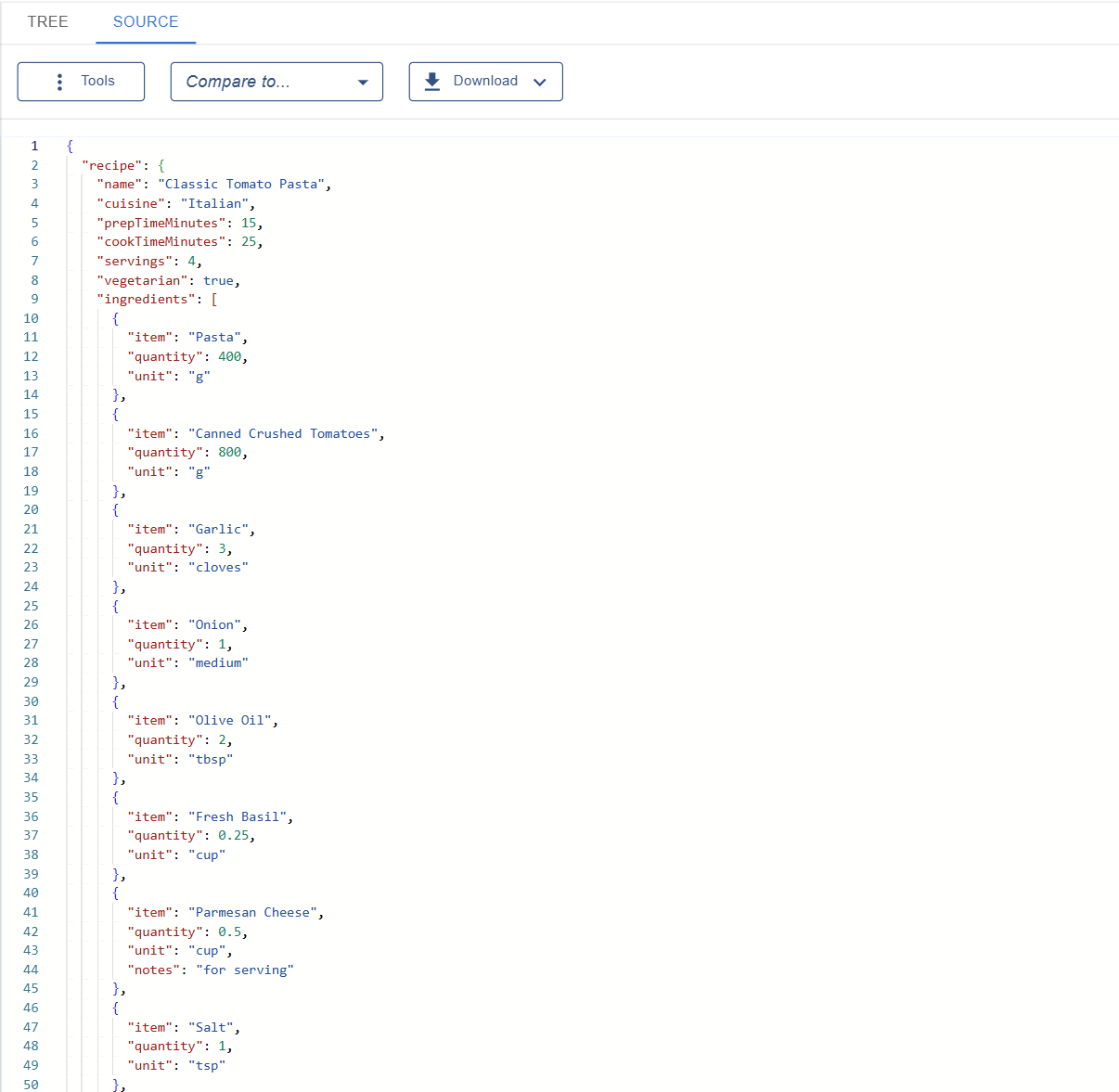
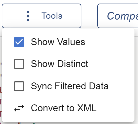
- Tools:
Show Values toggles between showing the full source with data values and showing only the structure (keys/tags) with empty values. This is enabled by default.Show Distinct toggles a view showing only distinct structural nodes, removing duplicate structures sometimes found in arrays. This will automatically enable Show Values if not enabled.Sync Filtered Data toggles the sync of the source editor with any filters that are applied in the Tree View. If you download the file, values will correspond to any active filters when this is enabled.Convert Format allows converting the current data view to JSON or XML depending on the file's format.
In order to edit the file, Show Values must be enabled, while Show Distinct and Sync Filtered Data must be disabled.
- File Editing: The file contents can be edited by clicking the
Edit button. Edits made in a file (and saved) will be reflected across the whole application.
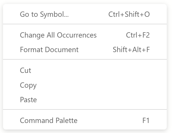
- Editor Actions: The editor supports standard Monaco actions such as
Go to Symbol, Change all Occurences, and Format Document. These can be accessed by right-clicking or using keyboard shortcuts.
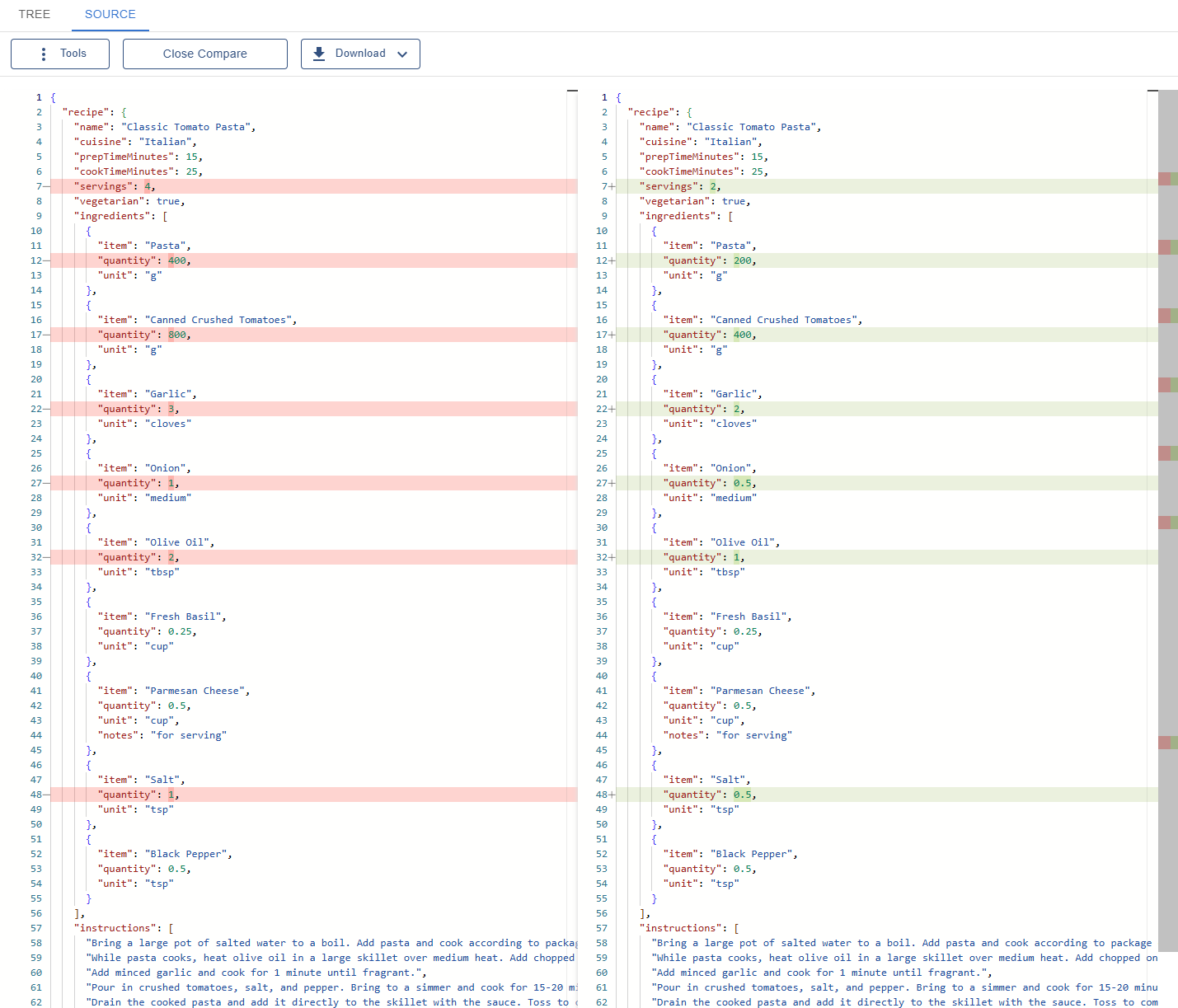
- Compare To...: A dropdown menu allows selecting any other file currently loaded in the application. Selecting a file initiates a comparison, opening a side-by-side diff view showing the differences between the current file and the selected file.
- Download: A download button allows saving the source content to a local file, formatted or minified.
Switching Between Files
To switch between uploaded files in the tree or source view, the shortcut shift+up/down-arrow can be used.